Terra-Cotta Creates a Surprising Terrazzo Floor at This Renovated Italian Barn
Clay offcuts were sprinkled into the concrete, one of several new textures that went into making the space a home.
Houses We Love: Every day we feature a remarkable space submitted by our community of architects, designers, builders, and homeowners. Have one to share? Post it here.
Project Details:
Location: Padova, Italy
Architect: Bongiana Architetture / @bongianaarchitetture
Footprint: 3,229 square feet
Builder: F.lli Schivo
Structural and Civil Engineer: Stefano Debiasi
Landscape Design: Studio Annachiara Vendramin
Photographer: Riccardo De Vecchi / @riccardodevecchi.photo
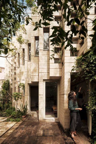
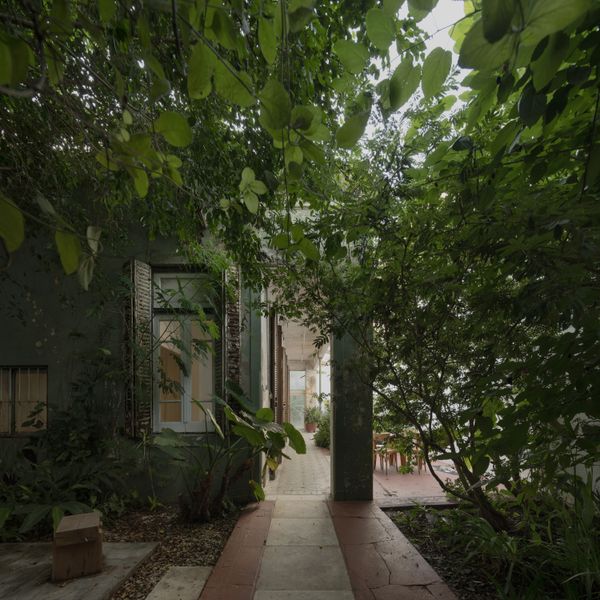
From the Architect: “Set amid a small valley of vineyards, Texturized House by Bongiana Architetture is an extension of a modest rural building, a contemporary retreat designed to host family celebrations and intimate gatherings, where architecture shapes atmosphere through light and raw materiality. The project is grounded in the principle of raw purity: rough surfaces, exposed materials, and details reduced to their essence. Each wall and floor is the result of a specific interpretation, turning every surface into a visual and tactile narrative. The structure reveals its own body with pride, in a play of textures that multiplies spatial perception.
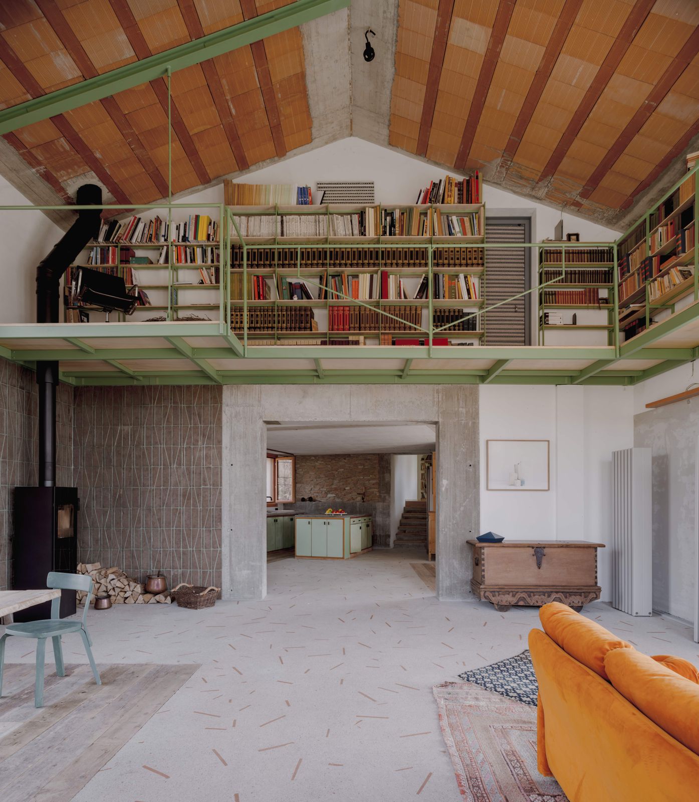
“At the heart of the project lies the double-height barn, conceived as a large luminous cavity. Here, the intent was to bring in as much natural light as possible, which filters through openings and reflects on the textured surfaces, animating the space with shifting shadows. Within this volume rises a suspended bookshelf, creating a new intermediate, airy, and intimate space that dialogues with the openness below. The theme of fire weaves through the house, connecting memory and the contemporary: in the old part, the original fireplace remains, while in the barn, a cast-iron stove becomes the new focal point. Around it, the walls are clad with split terra-cotta tiles, designed by Bongiana Architetture for Terraformae, where the interpretation of the joint becomes the sole decorative motif.
“The new concrete floor further tells this story of reinterpreted tradition: a surface that recalls the Venetian terrazzo, but instead of marble fragments, it incorporates reclaimed terra-cotta slats, cut from the hollow bricks used to clad the portico’s pillars. A gesture that ties the ground to the structure, weaving memory and material in a contemporary key. The furnishings add another layer of memory: carefully selected reclaimed pieces, such as a 1950s kitchen salvaged from an old house and transformed to begin a new life here. Old and new intertwine naturally, giving shape to a coherent and lived-in narrative.
“The retreat is nestled among vineyards, where raw surfaces and light craft essential atmospheres. The double-height barn hosts a suspended bookshelf and a cast-iron stove, surrounded by split terra-cotta tiles where the joint itself becomes decoration. The concrete floor reinterprets Venetian tradition with reclaimed terra-cotta slats, weaving memory and material. Recovered furnishings, like a transformed 1950s kitchen, complete this story where every surface speaks and every detail lives.”
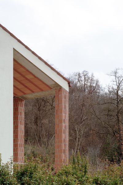
Photo by Riccardo De Vecchi

Photo by Riccardo De Vecchi
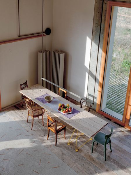
Photo by Riccardo De Vecchi
See the full story on Dwell.com: Terra-Cotta Creates a Surprising Terrazzo Floor at This Renovated Italian Barn